

Exceptional theming at scale

In the category of things that don’t make sense for typical app development: building a fully custom theming engine. Both iOS & Android come with theming capabilities out of the box. These usually suffice. They did not work for us, because we’re building a SaaS app platform. So we did build a custom theming engine. The engine has helped us ship themed apps on our platform since 2014. In this post we’ll detail what we built, how it has evolved and the lessons learnt along the way.
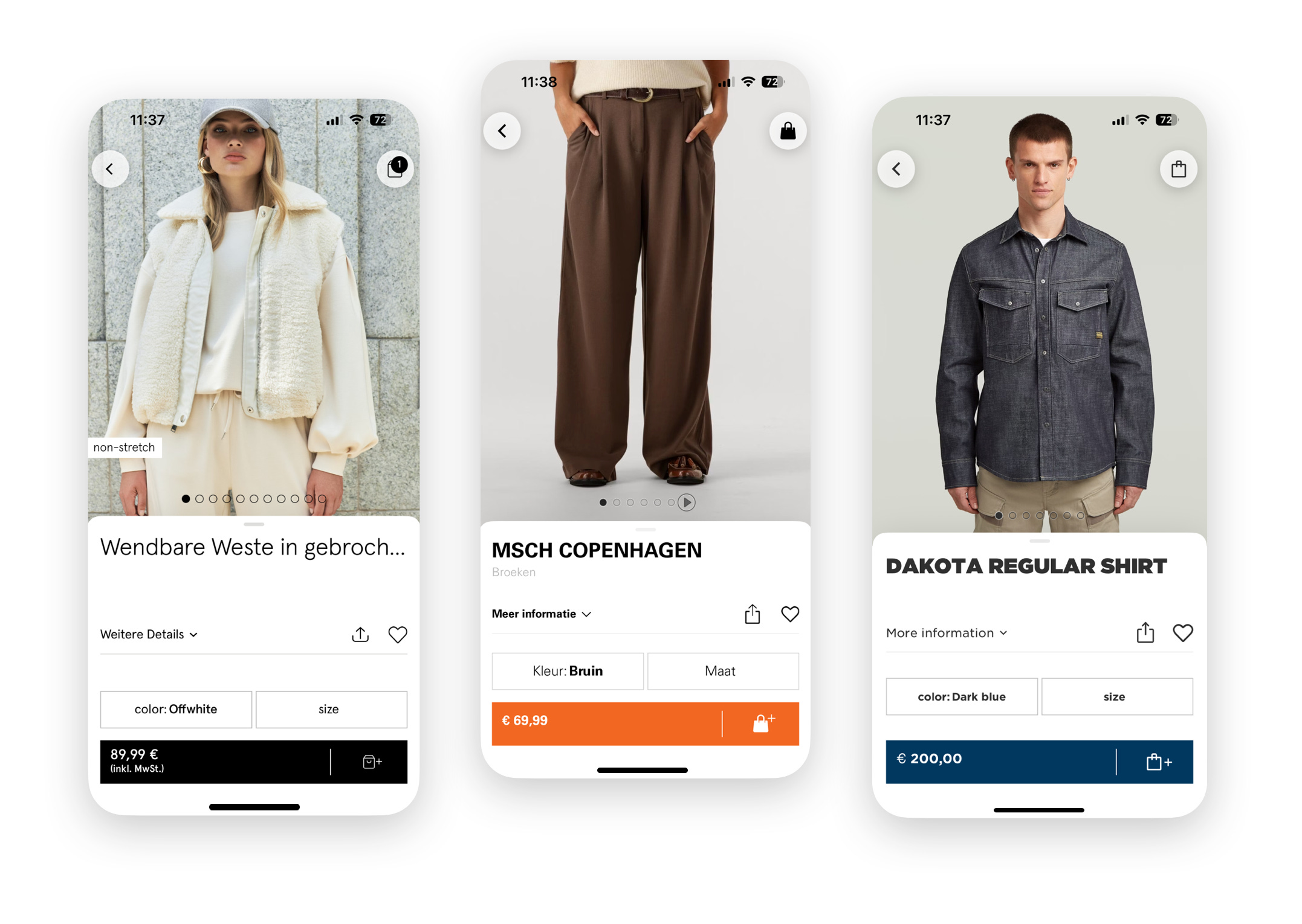
Our Shopping App platform is powering 40+ shopping apps across iOS & Android, trusted by brands and rated five stars by millions of users worldwide. On the app-side, our platform consists of a set of native frameworks for iOS & Android that are shared by all (white-label) apps using our platform. The frameworks contain the vast majority of all logic. We add brand-specific logic for configuration and theming, which consists of around 1% of an app’s total lines of code. Of this 1%, the majority (around 1000 lines of code) is related to theming.
Both iOS and Android have built-in support for defining an app’s theme, but it is limited to a single style and closely coupled to the views themselves. There are established open source solutions for the common use case: one app with multiple themes, from which the user can choose. We need something different, that did not yet exist: multiple apps, each with their own theme that describes how the shared set of views are styled. That is why we ended up building our own theming engine.
When we started out, we did the logical thing and defined a list of colors and fonts that could be specified for each brand. Whenever a new brand would join, this list grew to accommodate their requests for specific exceptions from the existing list. They demanded exceptional theming, if you will. To steer clear from a future with an ever growing list of colors and fonts we decided to flip the problem on its head. Instead of having each brand project define a finite theme, we began to annotate all views in our platform frameworks with style id’s and classes. Brand-specific code could then define rules for any selection of these annotated views that specified how these views should be styled. If this sounds familiar, that’s no coincidence. This is how styling on the web works too. Great artists steal.
Views can be annotated with an id or one or more classes. Like with CSS, an id is a value that can be used to uniquely identify a specific view, e.g. homeWallHeaderTitle. Classes are values used to group similar elements together, e.g. heading and primaryButton. Annotating views for theming looks like this:
// iOS (UIKit, Swift)
originalPriceLabel.styleClasses = [ "originalPriceLabel", "caption1" ]

// iOS (SwiftUI, Swift)
ThemedText(state.originalPrice)
  .theme(styleClasses: "originalPriceLabel", "caption1")

// Android (Kotlin)
style(originalPriceTextView).c(
  R.string.theme_identifier_class_footnote,
  R.string.price_pair_price_label,
  R.string.price_pair_original_price_label
)
To style these views, theming rules are added in the brand-specific code. Each theming rule consists of two parts: the selector and the declarations. The selector determines what views are subject to the rule, the declarations describe what the view needs to look like. When we started out, theming rules needed to be added in code.
// iOS (Swift)
addSubRules(classes: ["productInfoView"]){
  addRule(classes: ["originalPriceLabel"]) { (label: UILabel) in
    label.font = GothamPro.book(size: 12)
  }
}

// Android (Kotlin)
engine.addRule(HierarchySelector(
    sel().c(R.string.price_pair_original_price_label),
    sel().c(R.string.theme_identifier_class_product_info_view)
)) { themable ->
    themable.setTypeface(gothamProBook)
    themable.setTextSize(12f)
}
Executing this brand-specific theming code (on app launch) adds all rules to the theming engine. From that moment, the theming engine makes sure that every view that is added on the screen is styled according to the theme. We achieve that by hooking into the appropriate systems. For UIKit, we swizzle didMoveToSuperview and related methods on UIView. For SwiftUI views we use custom modifiers that update styling-related properties of the environment. On Android, we use a custom layout inflator that installs a global layout listener and hierarchy change listener on each view. (We haven’t added support for Compose yet, but there we’d have to hook into the Modifier.) By hooking into the system, we could provide the view instances to each matching rule. This unlocked powerful theming capabilities.
With great power, comes great responsibility. Imagine what you can do with an actual UIKit-view instance. (A few ideas: get its parent, add new subviews or remove it completely.) On the one hand we were carefully crafting an SDK with clean and minimal API surface, and at the same time we were giving raw and unfettered access to our entire view hierarchy. Thinking about access makes sense for any unit in our code base, be it a class or a module, but it makes even more sense if you’re developing an SDK that other people will use. When we built the Android frameworks a few years later, we took the opportunity to improve on this part. Instead of giving actual view instances, we wrapped them in “themable” adapters, limiting the kind of things that could be done by clients of our SDK in their theming code.
The Android implementation was an incremental improvement, but the biggest downside remained: every theming change would require recompilation (during development) and an app release (to ship it to all users). We’d been thinking about a successor for a while when in 2023 we finally set out to build “next-gen theming”. With it, we would begin tackling the aforementioned problems and lay a solid foundation for the future.
Next-gen theming
To achieve our goal of enabling faster iteration, we knew we had to decouple the theme from the code. We decided to replace the in-code theme with an external theming definition file. To start, the file is bundled with the app binary. As to not reinvent the wheel in terms of syntax, we closely followed CSS and incorporated some of the things from Sass that we liked.
.productInfoView {
  .originalPriceLabel {
    font: $gothamBook 12;
  }
}
In this external theming definition, theming rules are again the combination of two parts: the selector (“original price label in a product info view”) and the declarations (“font is Gotham Book 12 pt“). Just like the rules defined in code. However, we need to do some more work to get the rules from the external theme definition into the theming engine. We’d first need to parse the definition and then for every rule make the equivalent call to addRule, with the parsed selector and a declarations closure/lambda that would apply the declarations from the definition when invoked.
We build apps for two platforms, but did not want to duplicate the parsing logic. We investigated using Kotlin Multiplatform to share all logic between the apps, but had to shelve the approach due to a 4MB binary size increase for the iOS Apps from including the Kotlin standard library. That would make it impossible for us to stay within the App Clips size limit. We were already using Kotlin on Android, so sharing code there would not come with a penalty. To limit the amount of platform-specific code that would need to be written, we decided to split the parsing logic in two steps:
A stand-alone compiler that runs on the developer’s machine when the app is built. It turns the external definition into an intermediate representation (IR). During this step, the compiler would perform extensive diagnostics and emit warnings and errors to notify the developer of any issues with the theme. The resulting IR is a strict format (json) that is easy to parse.
Platform-specific logic that deserialises the IR and applies it to the theming engine when the app launches. On Android, the IR models and logic are shared with the compiler, thanks to Kotlin Multiplatform. On iOS (where we couldn’t use KMP), we have a duplicate IR definition using Swift structs and leveraged Foundation’s
Codableto deserialize IR with little code required.
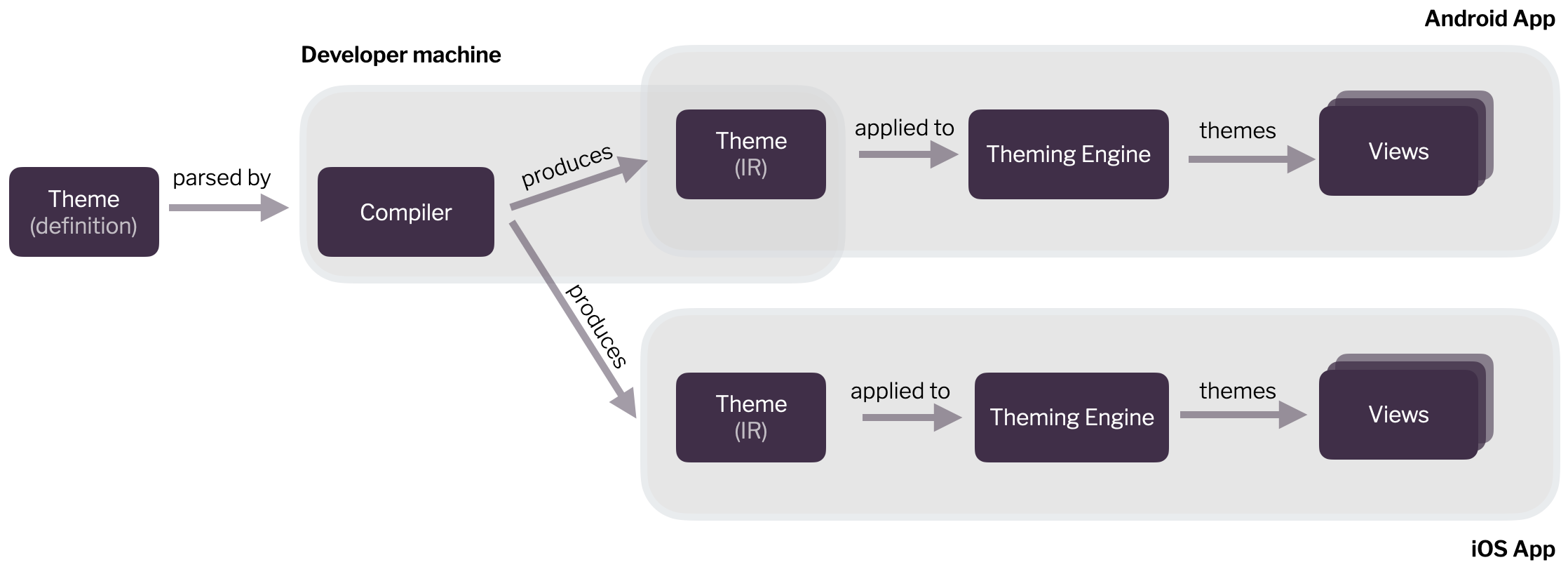
This approach successfully enabled us to keep duplicate code across iOS & Android to a minimum. All the heavy lifting happens in the compiler, which is shared between the platforms. It integrates with their build processes. We built a custom Gradle extension to integrate it into the Android build process. For iOS we initially had it as a “Run Script” build phase and have since integrated it into our Bazel set-up. On both platforms it is the “IR” version of the theme that gets bundled with the app.
The bundled IR file is loaded and deserialized on app launch. After the IR is deserialized, there is platform-specific glue code that deals with how the rule’s declarations are applied to UIKit, SwiftUI or Android views.
Development Mode
With the external theme definition and compiler in place, we turned to improving the developer experience. Now that the theme was no longer defined in source, there was less of a reason to require a recompile and relaunch of the app. (Small theming changes would regularly take more than a minute to compile.) We were once again inspired by web technology and added a “development mode” to the compiler.
In development mode, the compiler and app connect to each other using zeroconf and a websocket. The compiler watches the external theming file and whenever it changes, compiles it and sends the resulting IR over the websocket to the app. The app applies the new theme to the views that are visible on the screen, without requiring a relaunch.
Here’s a demo:
Development mode has been a great improvement in developer experience. It has helped reduce the effort it takes to theme a new brand by 33%. We’re happy with our bet on Kotlin Multiplatform, because it’s getting a lot of traction. The next-gen theming project has laid the foundation for the future of our exceptionally themed shopping apps. We’re excited about what it will allow us to build for our customers.